A Sleek and Edgy Atlanta Penthouse
CANTONI DESIGNER KOHL SUDNIKOVICH GIVES AN UP-FOR-GRABS W RESIDENCE A GLAMOROUS-MEETS-EDGY NEW LOOK.
A global business executive with multiple homes around the world had a hot property to sell: A spacious penthouse at The Residences at the W Atlanta-Downtown. As the largest penthouse in the building, the architecture and backdrop are one-of-a-kind, with two-story, floor-to-ceiling windows, top-of-the-line finishes and luxurious wall coverings. But, in listing his home on the market with Realtor Adrian Schmidt of Atlanta Fine Homes/Sotheby’s International Realty, the owner realized he needed equally sophisticated furnishings, accessories and art in which to help attract potential buyers.
He happened upon images of Cantoni designer Kohl Sudnikovich’s previous design work (particularly, the calming W residence he designed for a young power couple) and knew Kohl could set the right vibe. “Cantoni has always been known for high-quality furnishings that are not just sleek and contemporary, but that are artistic in many cases, so we felt it would be a natural fit for the project,” Adrian says. Not to mention, “Kohl has a well-established reputation and extensive experience in creating dramatic spaces.”
From the outset, Kohl was inspired by the penthouse’s picturesque panoramas. “It has beautiful sunset views overlooking downtown Atlanta,” he says. “It’s a perfect penthouse for a hip, trendy person who is fashion-forward and who loves the vibrancy of downtown.”
In fact, the sleek high-profile landmark is in an ideal location—it is at the forefront of one of the city’s hottest growth pockets with ideal access to all downtown has to offer. Iconic sights in view include Mercedes Benz Stadium, Philips Arena and the cultural attractions of Centennial Park. “W has always used design, architecture and a cool vibe to create a modern boutique experience,” Adrian says. “We wanted to reflect these aspects in the interiors in a way that was sleek and dramatic yet comfortable and inviting.”
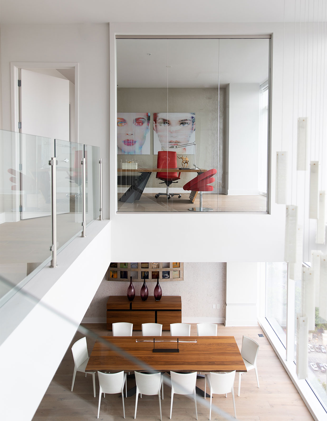
Kohl aimed to set this tone while also capitalizing on the surroundings, the bright, natural light and the W’s inherent edginess with soft textiles, vibrant accents and bold art. He started with clean-lined neutral pieces, such as the high-gloss white lacquer One and Only Half Moon console in the entry and, in the dining room, the Spyder walnut-top dining table surrounded by embossed crocodile leather chairs and the smooth walnut sideboard.
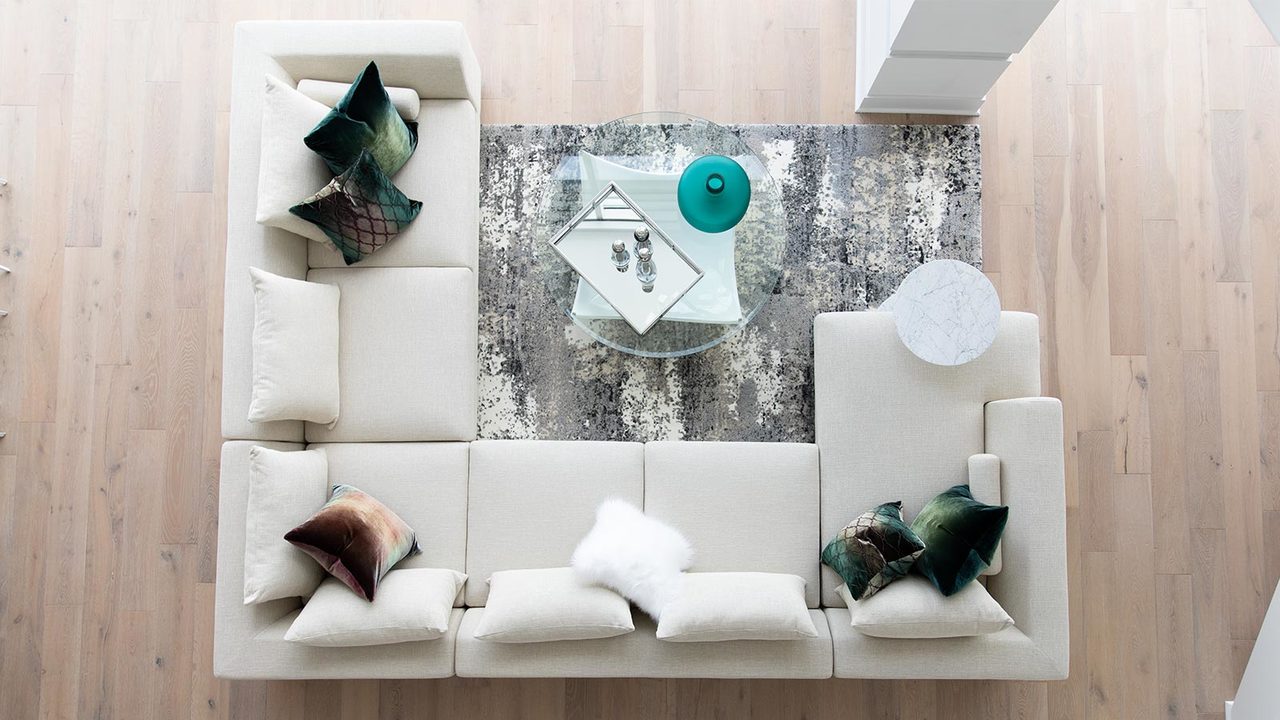
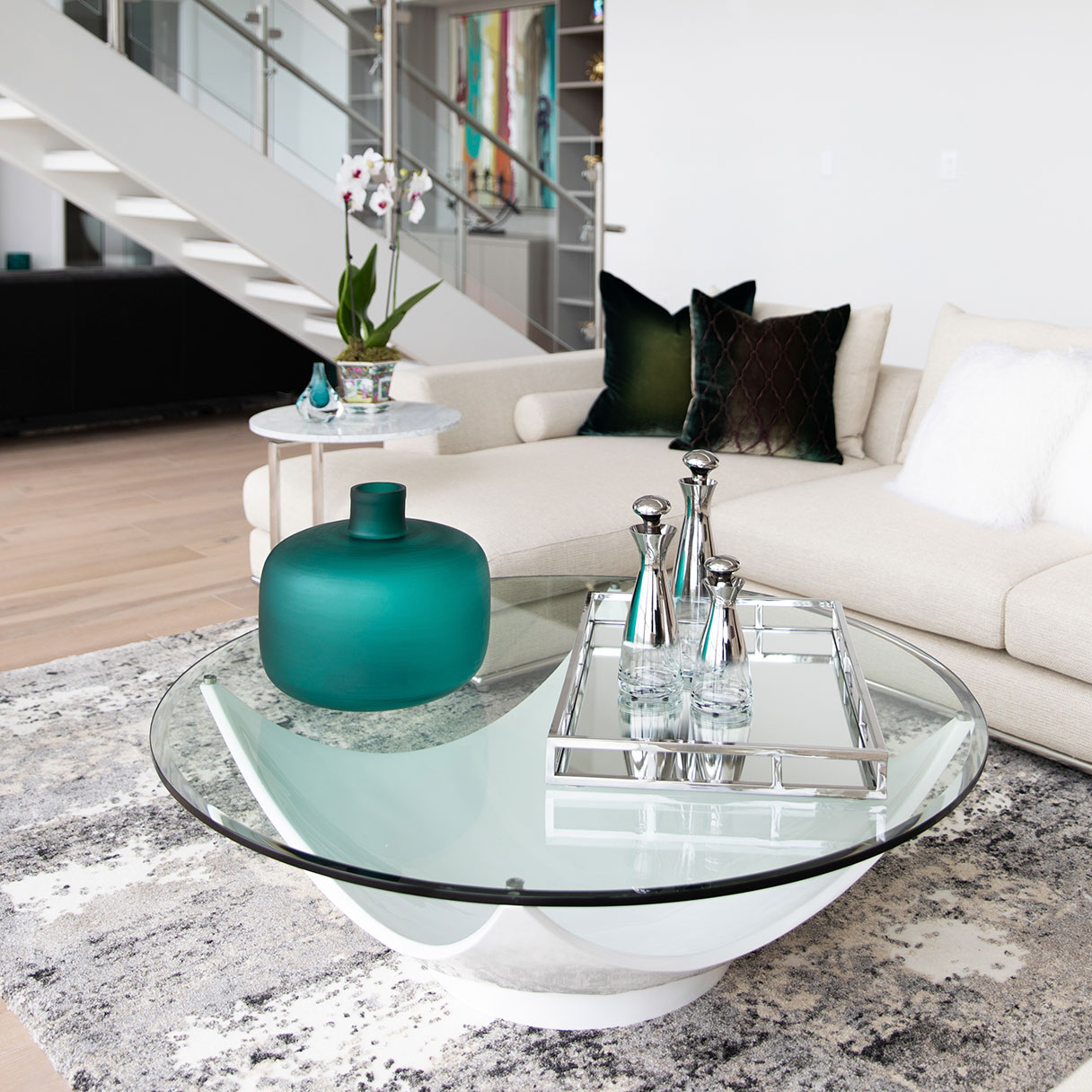
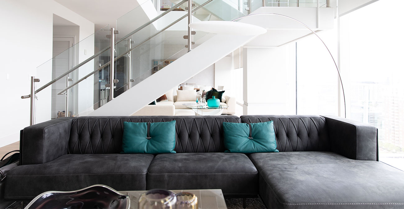
He brought in the white Melvin bar stools in the kitchen and created two seating areas for relaxing and entertaining in the great living room, which is divided by a sleek staircase. On one end, he combined the Mercer large sectional in cream with the Bowl white cocktail table and the white Carrara marble accent table for a fresh and airy look. Kicking it up a notch in the second seating area, Kohl paired the graphite McQueen sectional—handcrafted in Italy—with the Sushi square cocktail table. “Kohl listens carefully and is able to help clients quickly visualize the design direction,” Adrian says. “He was very professional and highly knowledgeable about design principles.”
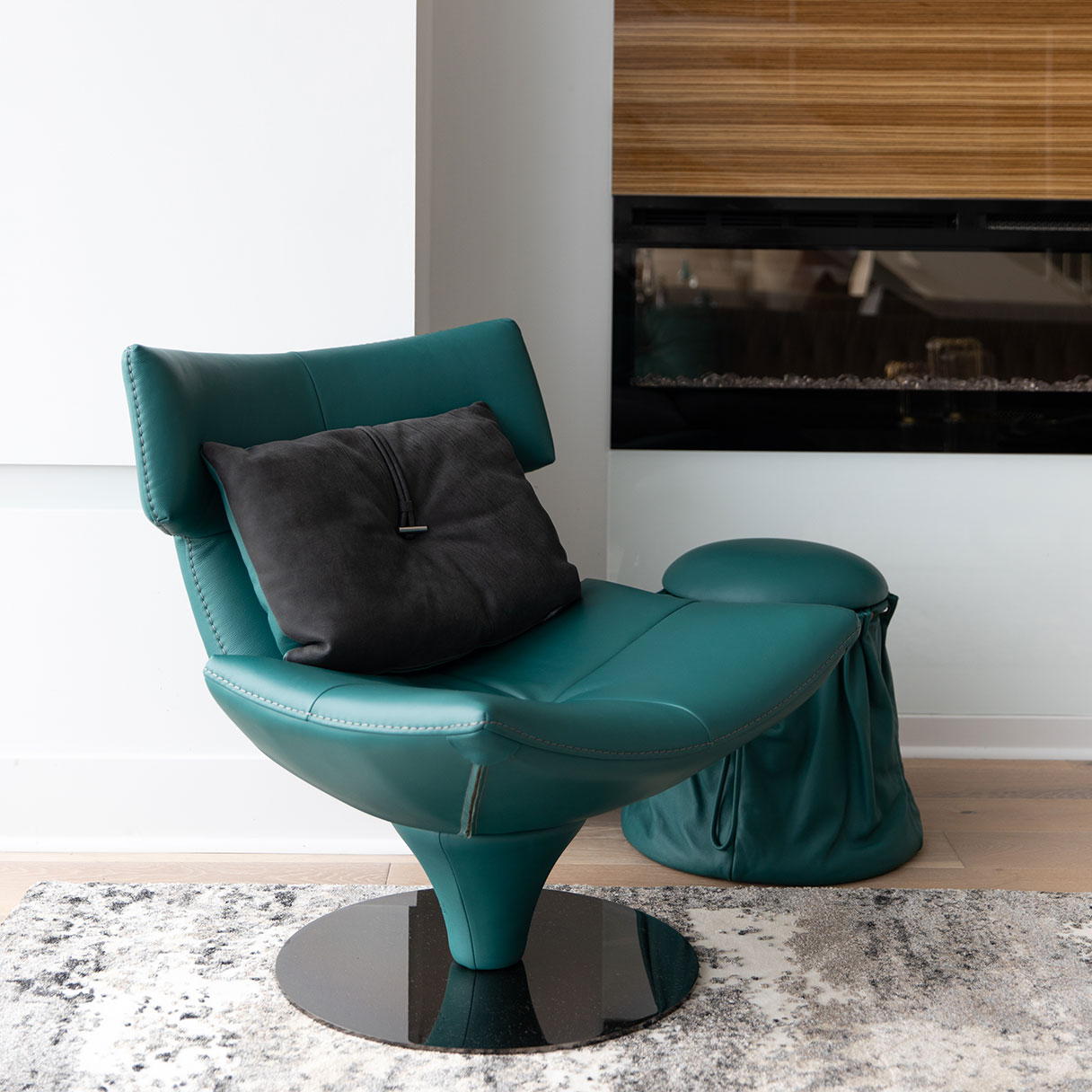
To tie the two seating areas together, Kohl brought in two Viera area rugs in grey along with punches of color—specifically, teal and purple hues. Highlights include the living room’s throw pillows, the Charlotte magazine bag, the Harley swivel chair, and the Sugar stool, all in teal leather. Additionally, he transformed a third bedroom space into an office and brought in bright shades of red with the Vistoso executive chair and the Circle swivel chair surrounding the Nasdaq desk. He also incorporated a game space with a bar and brought in Viper bar stools and a dining table that opens to reveal a billiard table.
In the two remaining bedrooms—which are both master suites—he nodded to the existing wallpapers. In one, he leaned on white hues, with the white-tufted king bed and a sumptuous Lady G chaise just outside the bath for lounging. In the other, he used the Billy Keramik coffee tables in lieu of nightstands, which he combined with the luxurious M Place king bed, the M Place bench and a fluffy dark brown sheep area rug. “I wanted to blend in numerous soft textures to create a relaxed atmosphere,” Kohl says.
It perfectly captured the look the owner had hoped to achieve. “Kohl took cues from the W’s design aesthetic and created spaces that are both a tribute to the architecture and reflective of Atlanta’s energy and excitement,” Adrian says. “The look is fabulous, but the ‘feel’ of the furnishings is just as rewarding. They have quality craftsmanship and true comfort.”


